From research I found that Tonic Collective's clients always referred to them as Tonic. This reinforced the decision to remove 'Collective' from the logo. The decision made the logo more flexible and impactful.
However it was important to communicate the idea of the Collective as this is a core part of the brand story and expertise of the business.
The video player cannot render on the server side
The video player cannot render on the server side
The video player cannot render on the server side
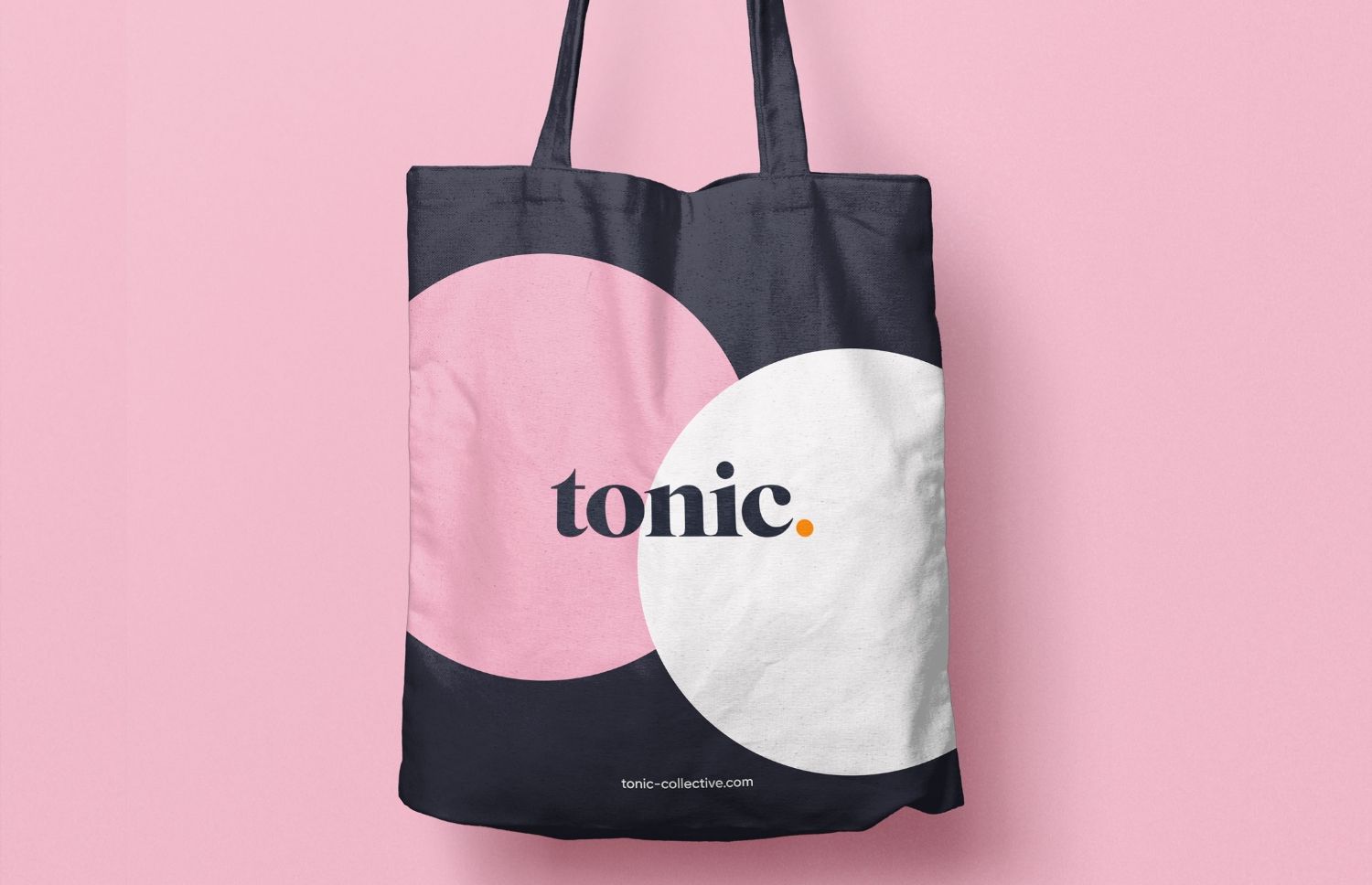
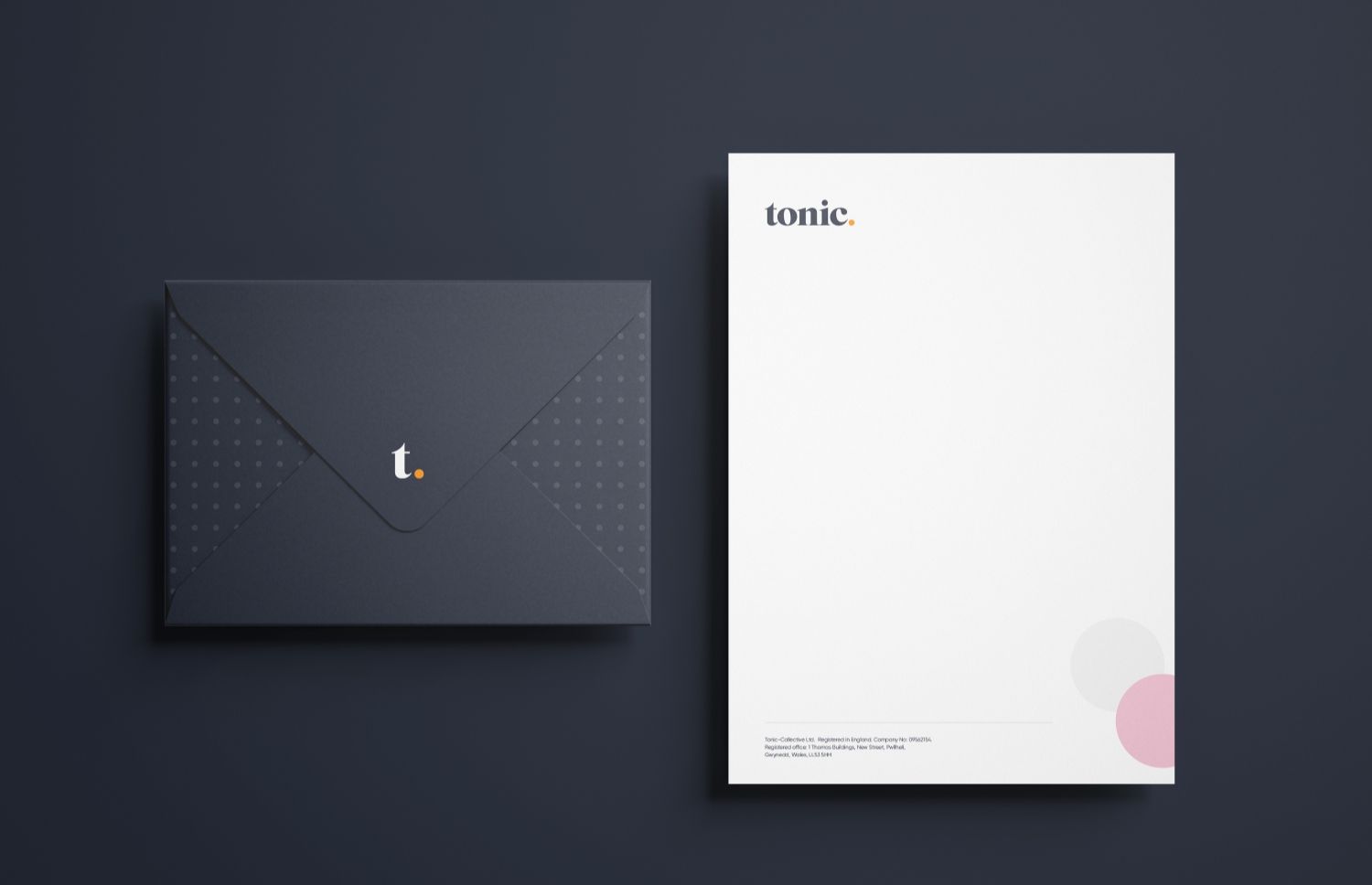
Creating an elegant collective dot pattern that applied the circle asset from the wordmark helped resolve the subtraction of the 'Collective' in the wordmark.
The circle asset is flexible as Tonic can use it in a bolder and more playful way depending on the context of the design it is used on.
After establishing Tonic's rejuvenated brand identity, it was now ready to implement the collateral that Tonic needed.
The video player cannot render on the server side
The video player cannot render on the server side
The video player cannot render on the server side
The video player cannot render on the server side

I designed and built PowerPoint template slides for tonic as they frequently needed them when pitching to clients. It was important to create functional slides that are engaging for different types and quantities of content.
The video player cannot render on the server side
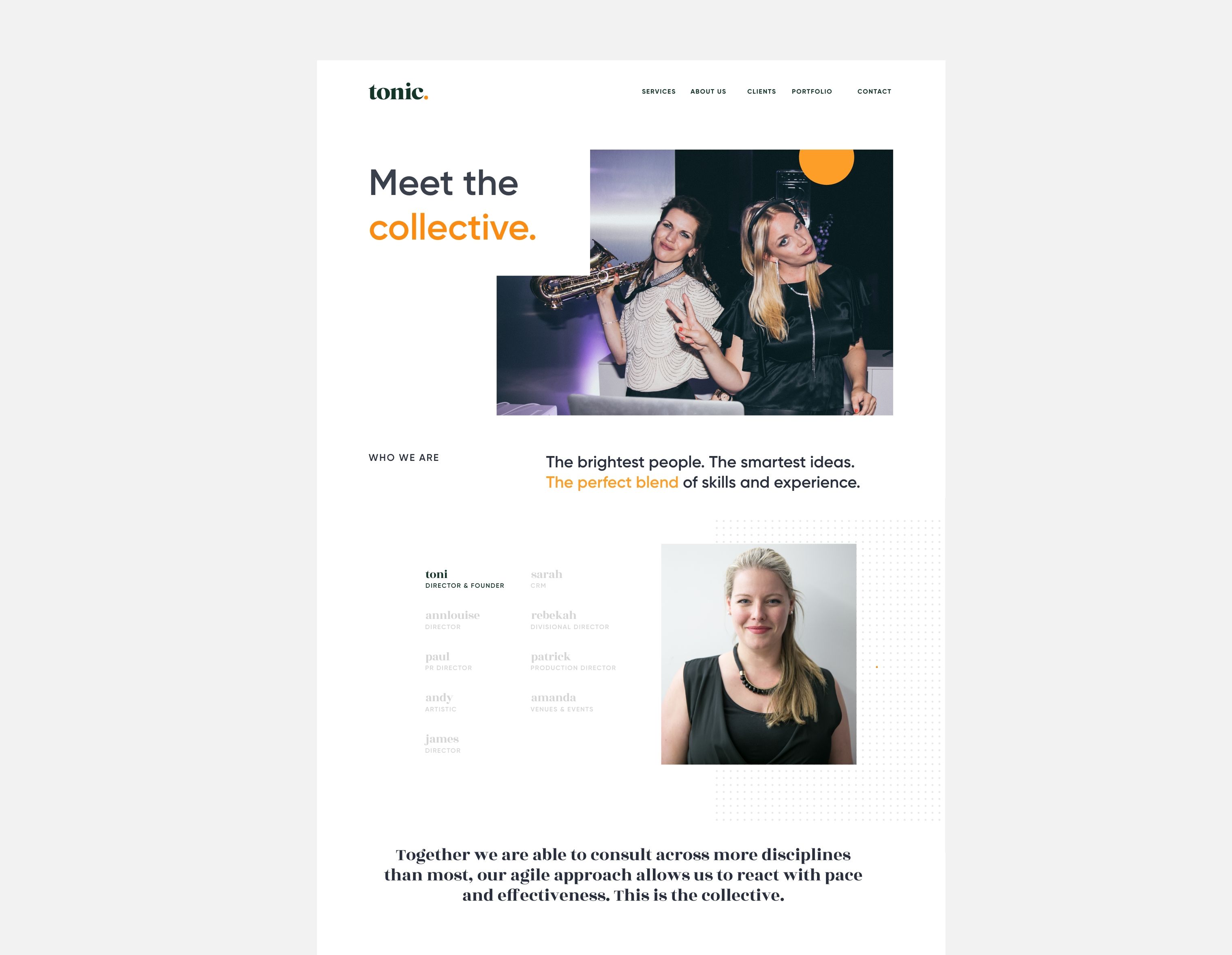
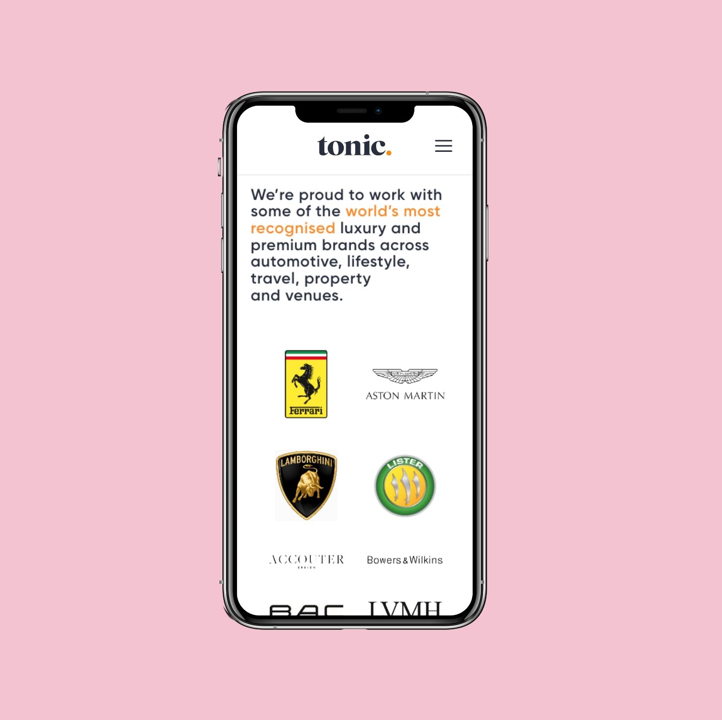
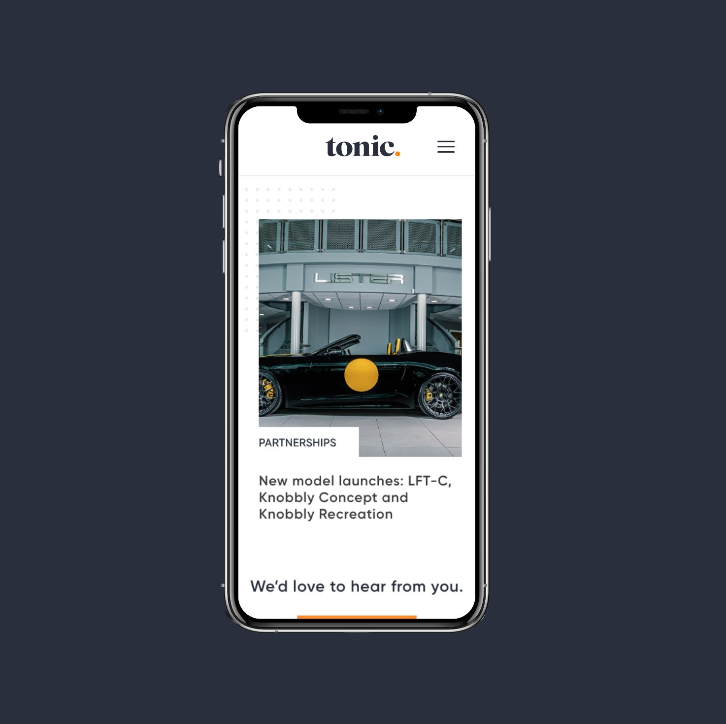
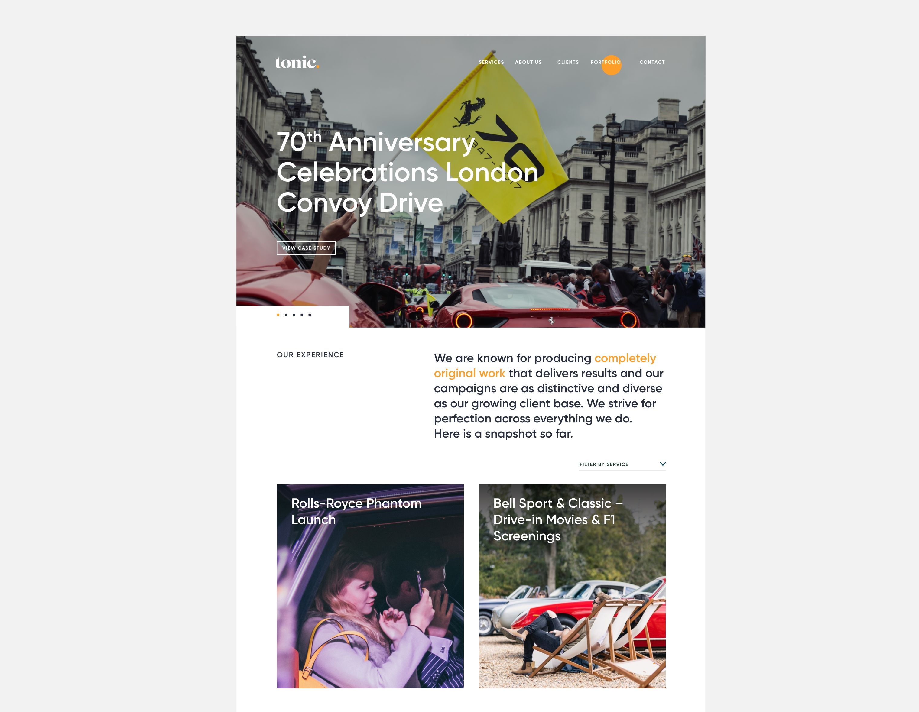
The aim of the website was to help Tonic acquire high value clients that they desired to collaborate with. Through visual storytelling of an immersive brand video, bespoke website interactions, user friendly experience and well balanced page layouts the website has given Tonic the ability to show off their achievement, expertise and capabilities.
The video player cannot render on the server side
The video player cannot render on the server side
The video player cannot render on the server side
